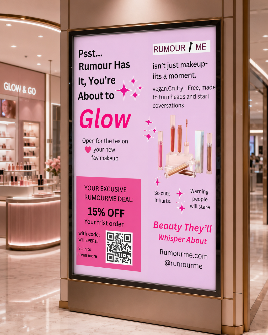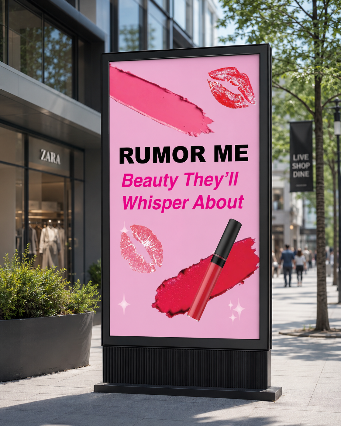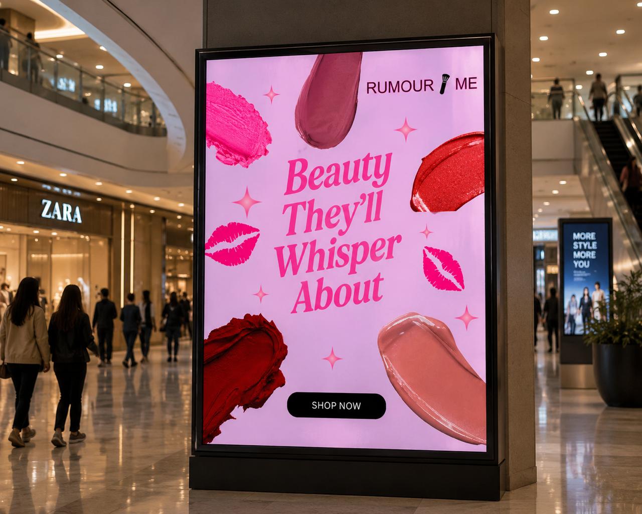
A modern beauty brand built around confidence and self-expression, with bold type and visuals designed to hold attention.
What the project set out to do, and the story behind the brand.
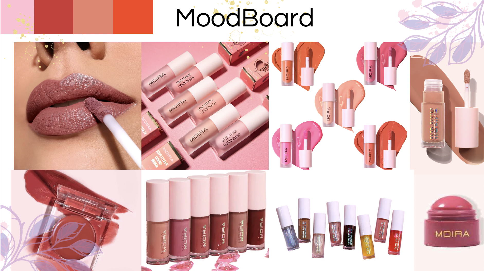
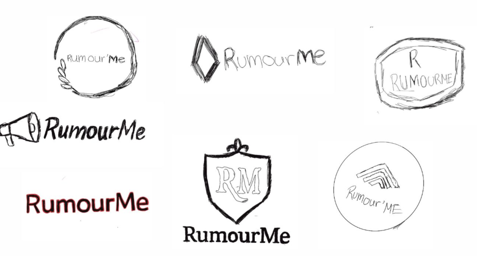
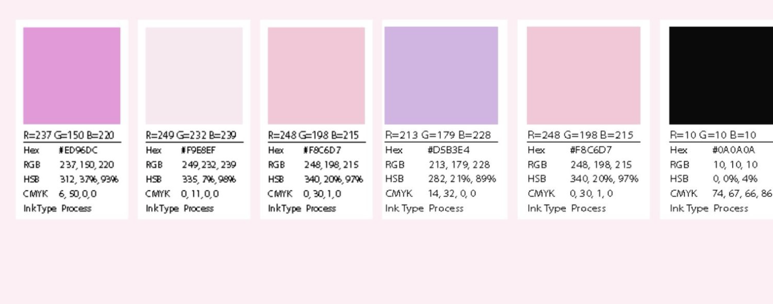
RumourMe began with a moodboard built around confidence, colour, and the kind of bold, gossip-adjacent tone the name suggests. From there, logo sketches and colour testing helped settle on a palette punchy enough to stop a scroll, before moving into ad and coupon layouts that carried that same energy across formats.
The main challenge was striking a balance between bold and approachable — early directions leaned either too soft (blending into typical beauty branding) or too loud (feeling more like a meme than a brand). Refining the type pairing and toning the colour palette helped the identity feel current and confident without losing approachability.
The final identity and campaign visuals feel bold and current, standing apart from the soft, muted aesthetic common across the beauty category, while still staying approachable enough to invite people in rather than intimidate them.
Early concepts, sketches, and exploration before the final direction.
The finished brand identity and campaign visuals.