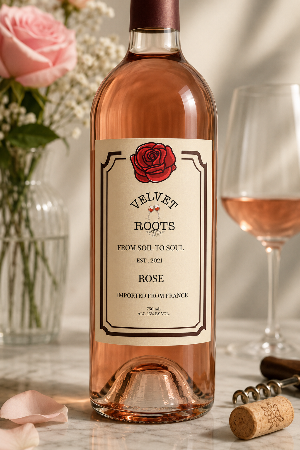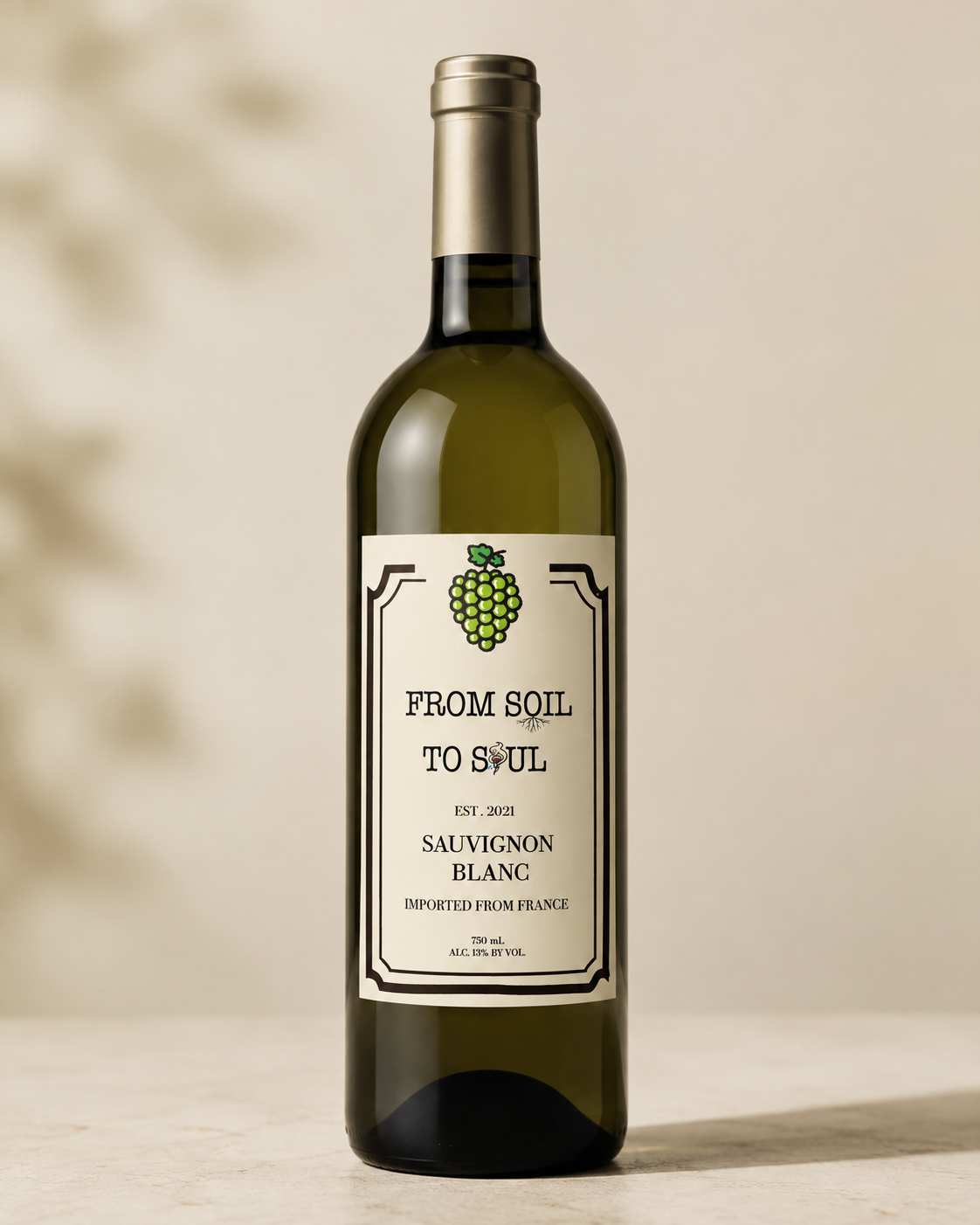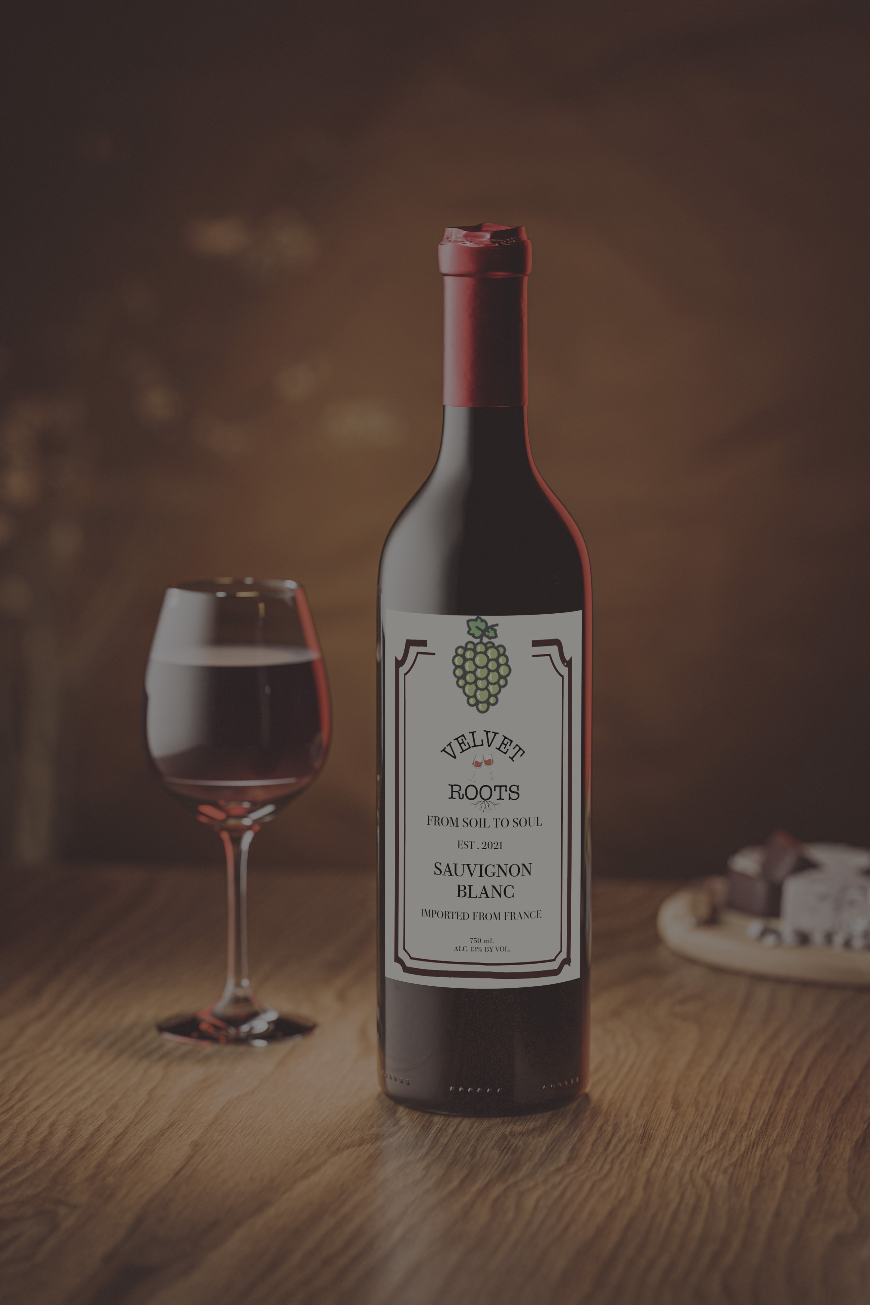
A wine system designed to feel rich and tactile on the shelf, with label details that reward a second look.
What the project set out to do, and the story behind the brand.
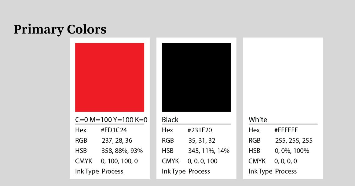
Velvet Roots began with research into how wine packaging communicates quality on a shelf full of competitors. From there, the work moved through label sketches, material studies, and a custom dieline before settling on a structural box design that felt substantial in hand. Foil detailing and a deep red palette were chosen to signal richness without leaning on cliché vineyard imagery.
The hardest part was balancing tactile, premium detail with something that could realistically be produced and folded as a working dieline. Early concepts looked great flat but didn't hold up structurally — several rounds of prototyping were needed to get proportions, fold lines, and label placement working together as one object, not just a 2D design wrapped around a box.
The final packaging system feels rich and tactile on the shelf, with label details — texture, foil, fold — that reward a closer look. It set the bottle apart from typical wine packaging while staying realistic to produce, and became one of the strongest packaging pieces in this portfolio.
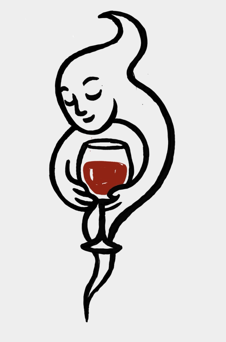
Early concepts, sketches, and exploration before the final direction.
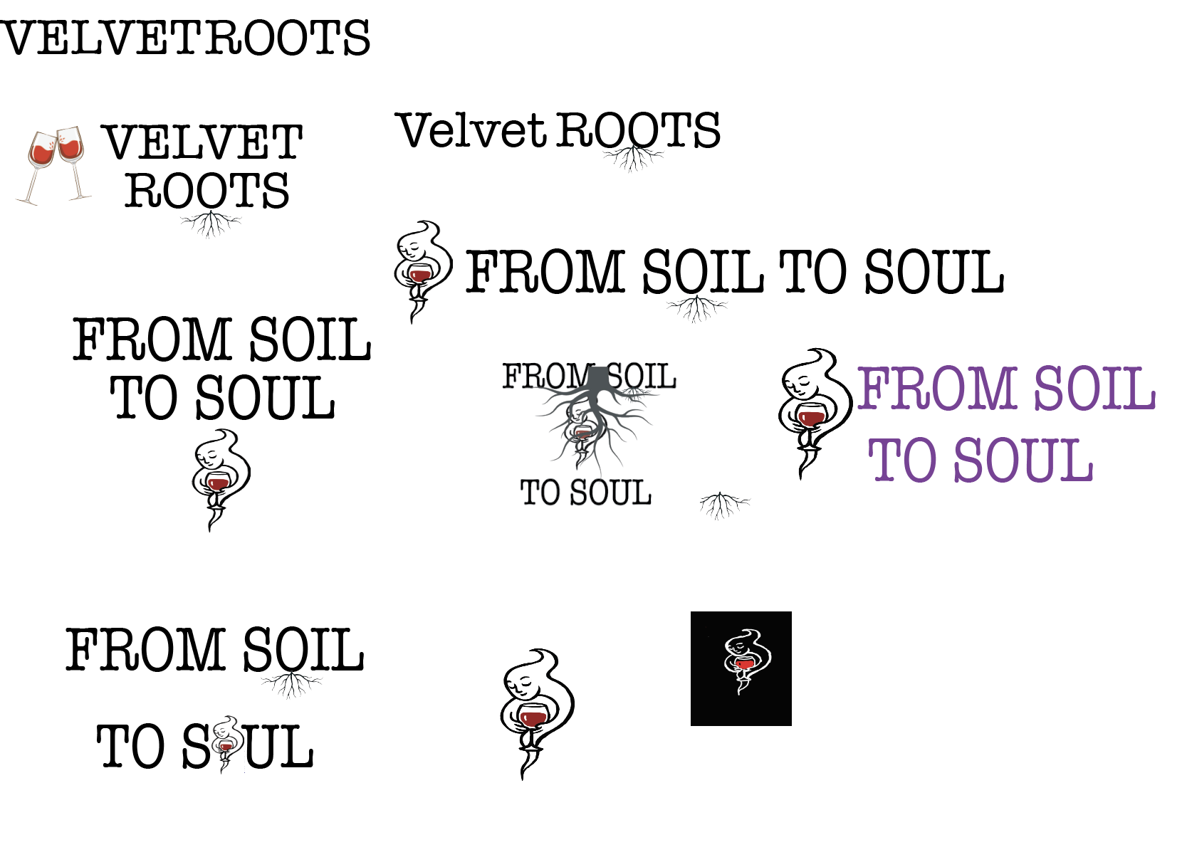
The finished packaging system.