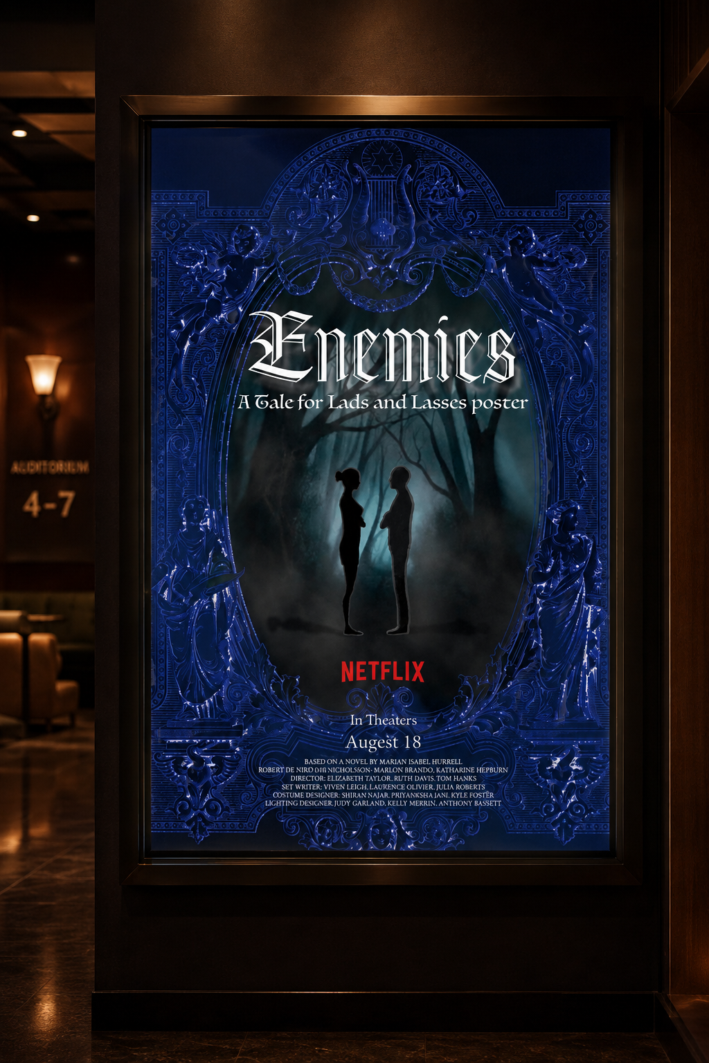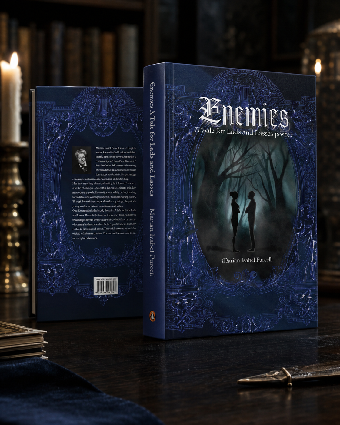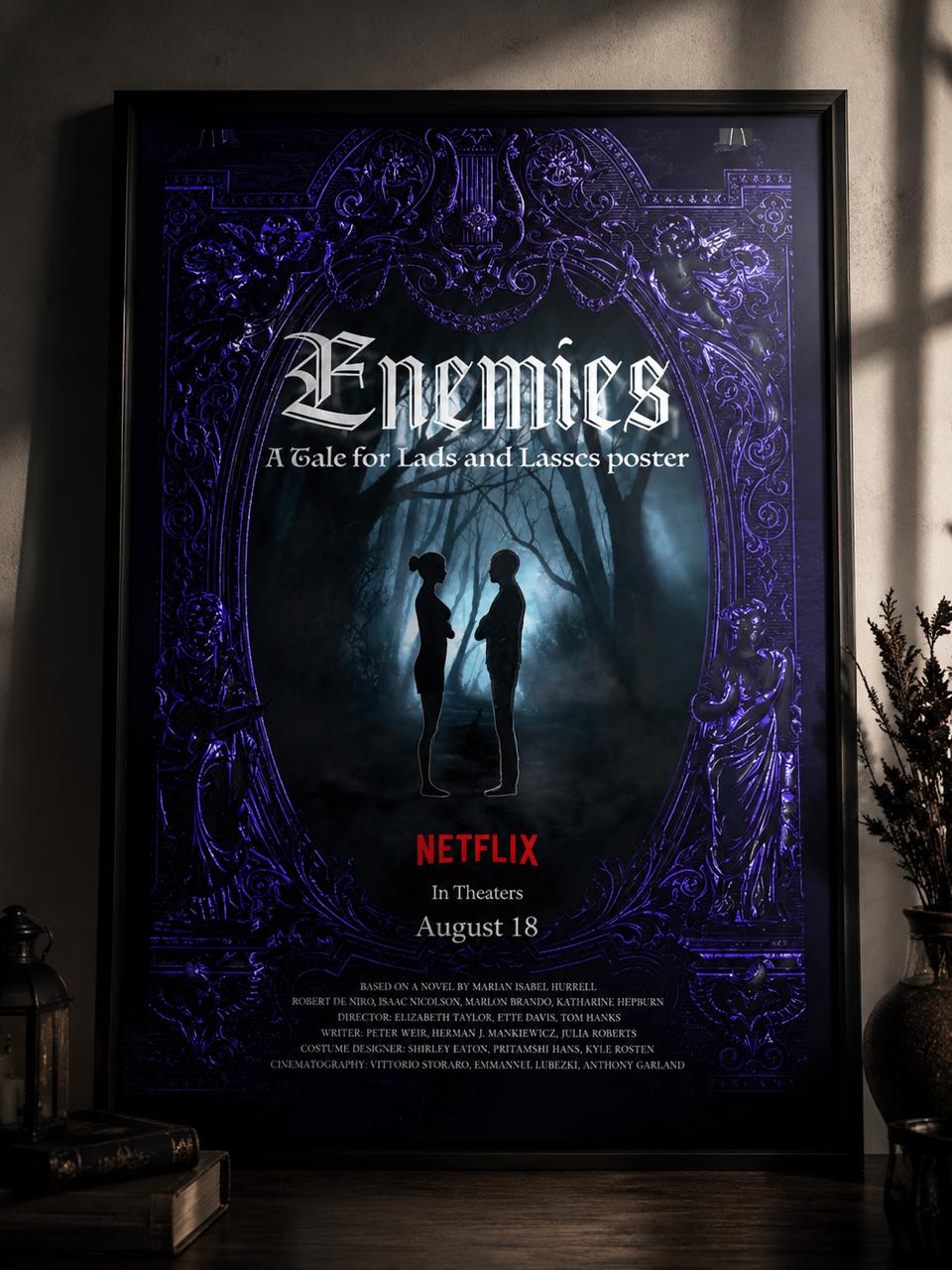
A movie poster concept balancing mood and narrative tension, using layered type and a restrained palette to set the tone.
What the project set out to do, and the story behind the design.
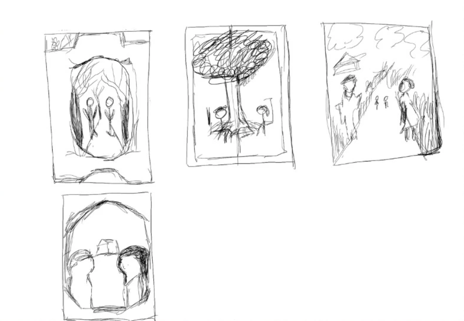
Work on this poster started with document illustration concepts and a moodboard exploring tone — tension, distance, and an unresolved conflict between two figures. From there, type layering and a restrained colour palette were tested to find a composition that read as dramatic without tipping into melodrama.
The hardest part was suggesting narrative tension with almost no information — no tagline, no cast, just two silhouettes and a title. Getting the framing, negative space, and type hierarchy to carry that weight took several rounds of composition testing before the poster felt like it was telling a story rather than just looking moody.
The final poster uses layered type and a restrained palette to set the tone before a viewer ever sees a trailer, letting the composition do the storytelling on its own — one of the more editorially considered pieces in this portfolio.
Early concepts, sketches, and exploration before the final direction.
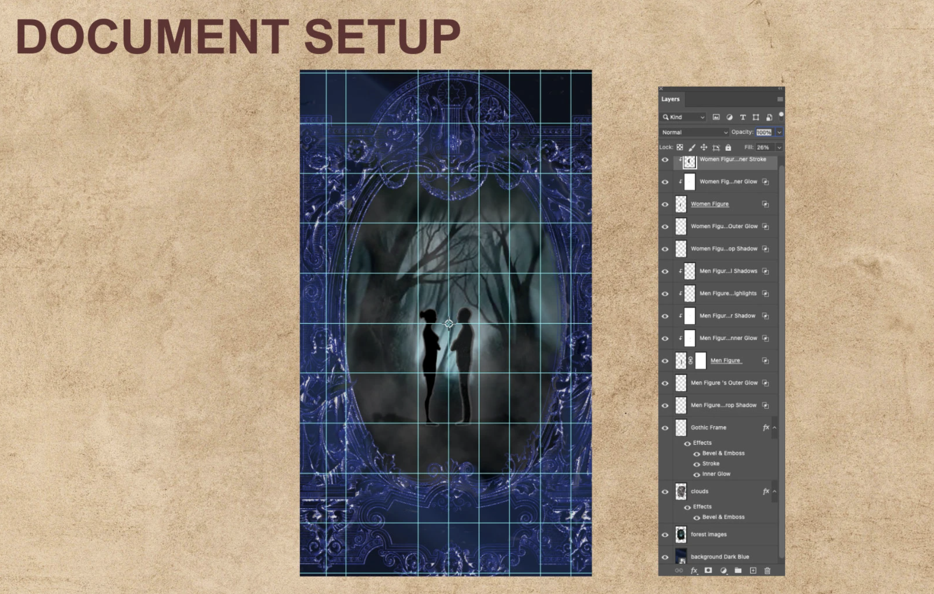
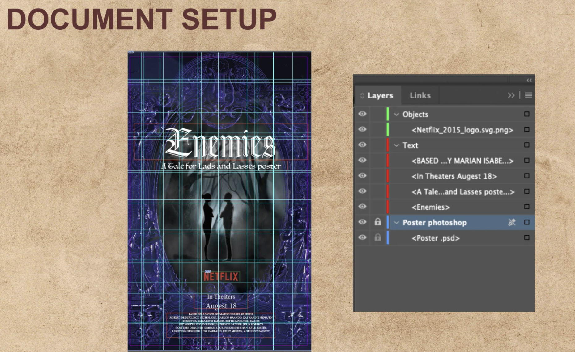
The finished poster design.